
A seamless extension of the Orange experience.
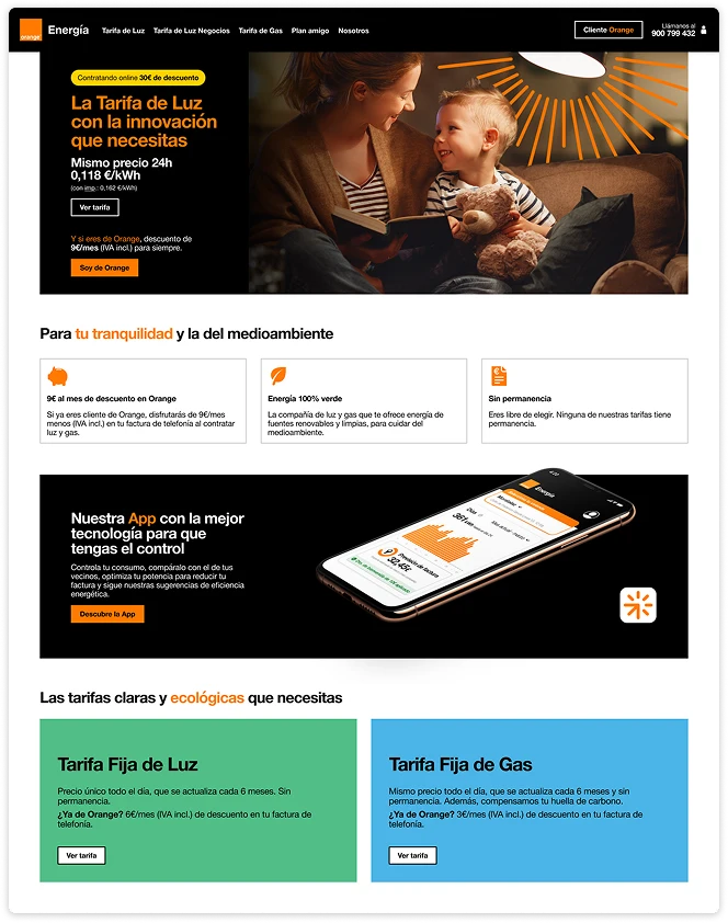
The Orange Energía website maintains the brand's visual identity and user experience, ensuring a familiar and intuitive space that simplifies service subscription.
Introduction
Orange Energía: The First Step in a New Era
After the Orange and MásMóvil merger, Orange Energía was the first brand to launch, showcasing the potential of this union and extending the brand's reach beyond telecommunications.

The business goal
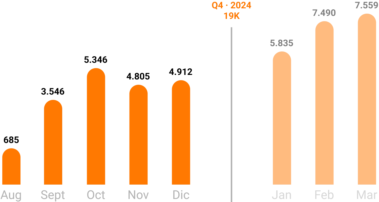
The objective was to reach 5K customers from august to the end of the year, leveraging Orange's brand trust and seamless user experience to drive adoption of its new energy service.

How were we going to achieve it?
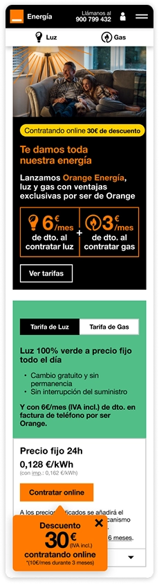
Beyond strictly following Orange's UI and product design, we leveraged our experience with existing brands, applying key learnings to create a seamless and optimized user journey.
The proposed solution
- •
Consistency in Visuals and UX.
We strictly followed Orange's design system to ensure a seamless and familiar experience.
- •
Leveraging Existing Brand Insights.
We applied key learnings from other Orange and MásMóvil projects to enhance usability.
- •
Applying Tested Learnings from Previous Subscription Flows.
We implemented insights from the EnergyGO onboarding process and other brands to optimize the experience.
- •
Building Trust in the New Service.
We maintained clear, transparent communication to reinforce credibility and user confidence.


The results
What didn't work?
- •
The launch happened in Q4, a challenging time, as Black Friday and Christmas campaigns concentrate most of Orange's focus on telecom. As a result, Orange Energía lacked visibility during this key period.
What did work?
- •
Target exceeded in October, well ahead of year-end forecast.
- •
Fast and easy sign-up, leveraging UX know-how from other brands.
- •
Consistent Orange look & feel built trust and comfort, boosting conversion.
Where do we go from here?
The launch marked a strong first step, but the real value lies in how the experience evolves. These are the key opportunities to keep improving and scaling the product:
- •
Learning from real user behavior:
Now that the site is live, tools will help identify friction points and validate key decisions. These insights will guide future optimizations and improve conversion.
- •
Activating cross-channel opportunities:
Bringing Orange Energía into physical stores and other sales channels opens the door to bundled offers with telecom services. This could enhance perceived value, drive cross-sell, and boost loyalty.
What I learned
Designing for Orange Energía was a powerful reminder that good design is not just about aesthetics — it's about alignment. Balancing business goals, user needs, and brand consistency within a large ecosystem challenged me to be more strategic, collaborative, and detail-oriented.
It also reinforced the value of designing with scalability in mind, anticipating how a product might grow across channels, teams, and contexts.